Goal: reduce registration drop-off
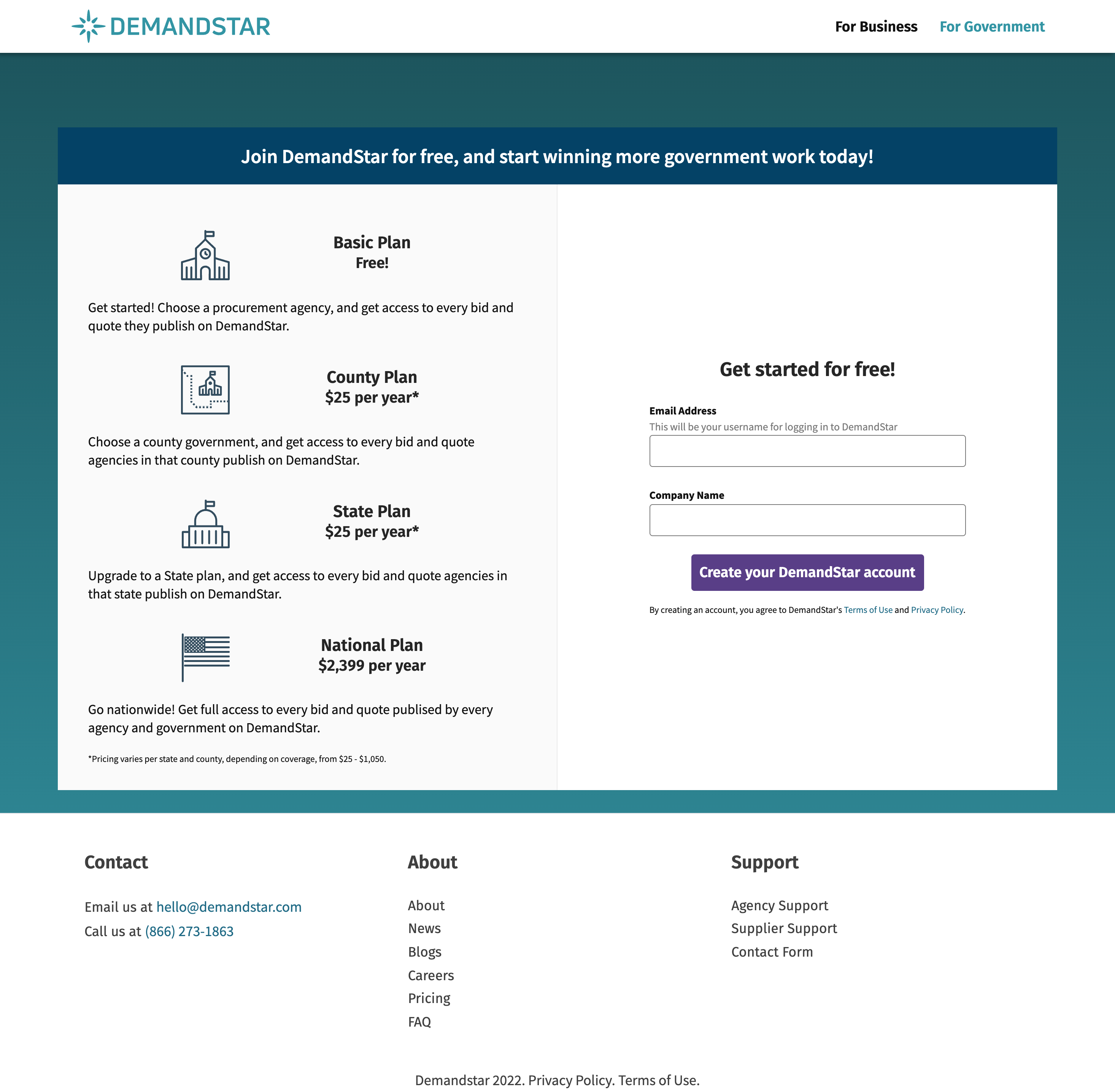
DemandStar is a double-sided marketplace. On one side, we have government agencies, which are onboarded by a dedicated team. On the other side are vendors, who self-serve to register onto the platform. DemandStar's analytics were showing significant drop-off in the registration process, which was several screens long and included a confusing product selection screen.
Constraint: no time for testing
The deadline on a revamped registration process was super short. In lieu of testing the existing process with suppliers, every employee at the company ran through registration and noted where they'd gotten confused or frustrated. This, along with analytics that highlighted problem areas, gave me a solid starting point.
Simplify!
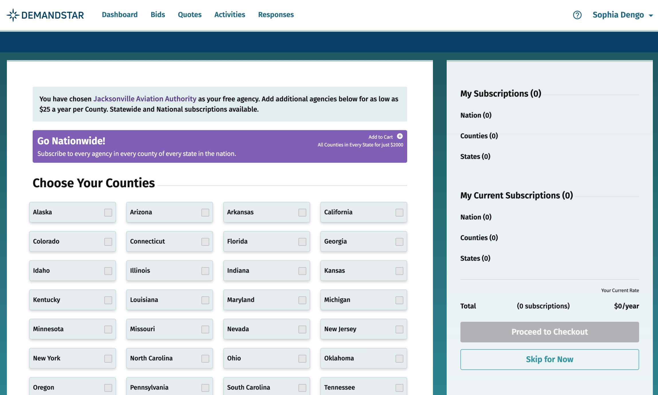
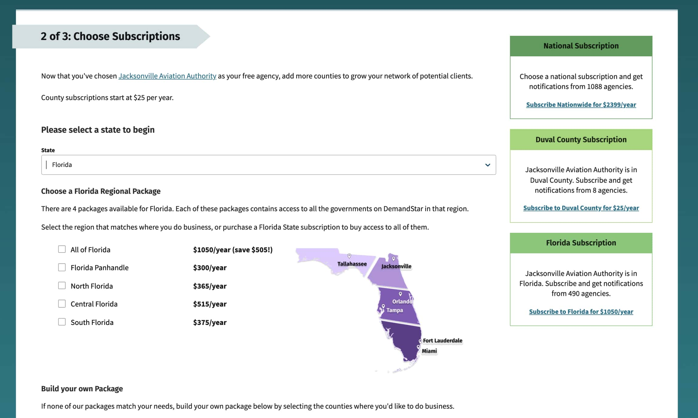
The biggest frustration was a screen where you'd choose a subscription product based on geography. Instead of a confusing grid of fifty choices, I introduced a simple drop-down presented in alphabetical order, which then presents the user with a cleaned-up view of further choices to make. By reducing the number of elements on the page, the user knows where to focus and can understand clearly what the next steps are. On release, we saw an uptick in completed registrations. As a major added benefit, the engineers who implemented UI changes substantially improved the codebase, so the process now runs faster and can be more readily experimented with to further improve the user experience and meet business goals.