Why start with an existing style guide?
When I joined DemandStar, I inherited a detailed but incomplete styleguide, and a platform that was built quickly and without a lot of attention to UI consistency. My responsibility as the sole designer at the company is to ensure that platform is usable, accessible, and as frictionless as possible. A big part of that, which is often overlooked, is visual consistency. I'm using the inherited guide as a starting point to build a styleguide full of Figma components that I can use to rapidly prototype, and that my engineering team can use as a canonical visual reference.
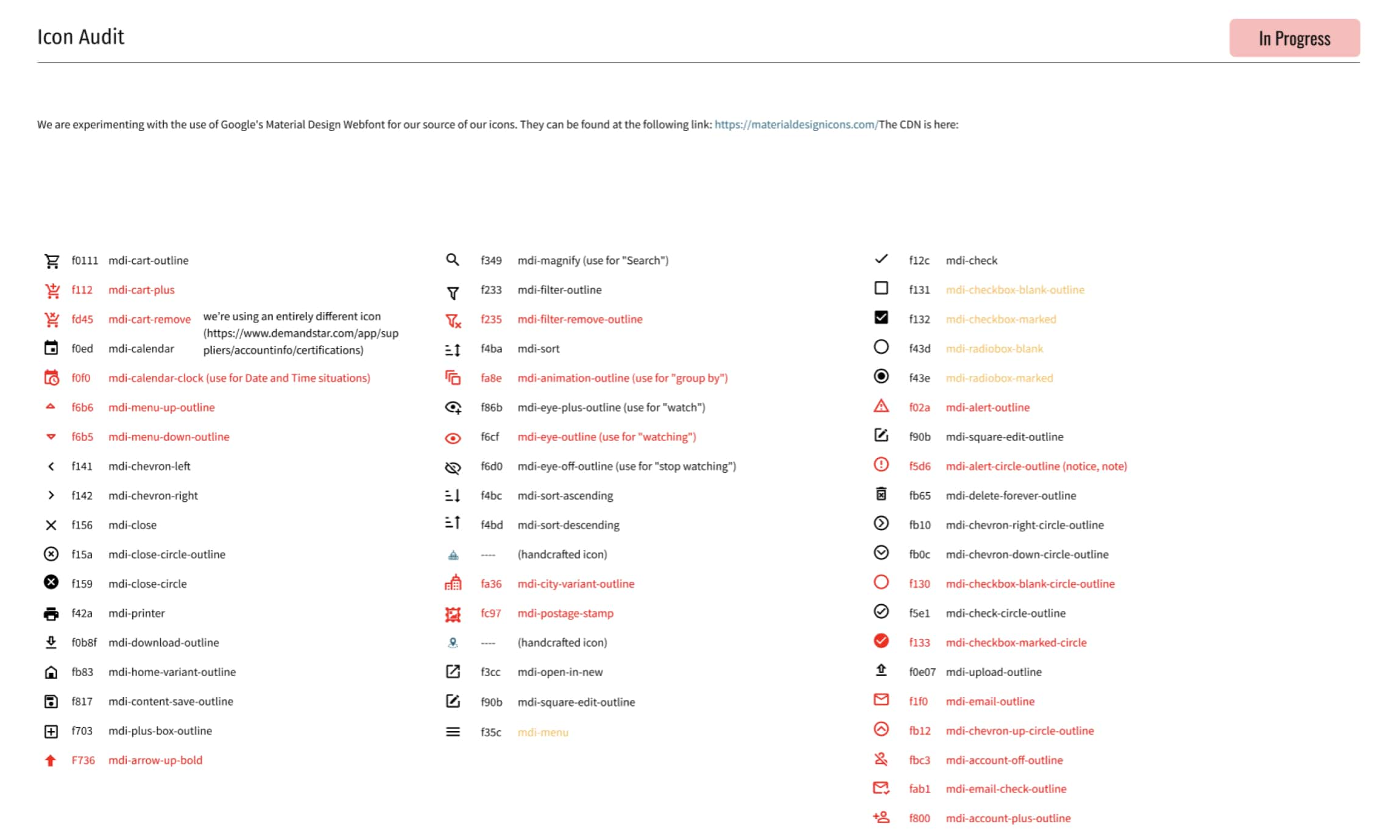
Audit the UI
It was pretty clear when I began that the platform and styleguide had already diverged pretty significantly, so the first step to a more robust system was to understand where the inconsistencies exist in the production interface. Knowing which patterns are used most often, which have diverged most often, and which are causing usability problems helps me know what to prioritize in the styleguide -- and what to ask the engineers to prioritize when they're building new components.
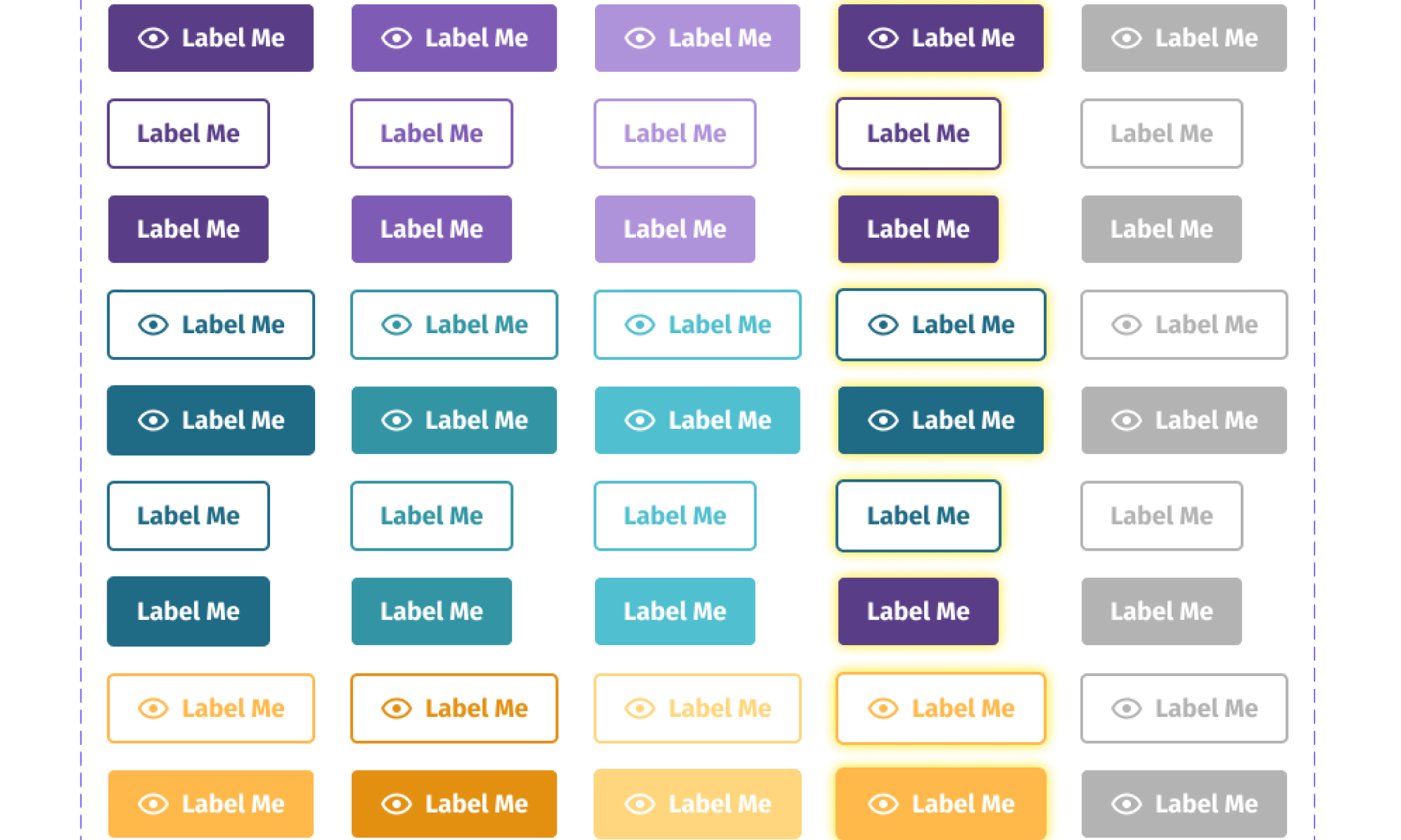
Build the styleguide
This will always be a work in progress. I began with the basics of any digital product: buttons and form controls. I moved from there into less frequently used pieces of the UI, like status tags, and new components, like alert boxes. Next up: combining my design assets with the engineering team's Storybook instance, so that we go from styleguide + component library to a functional design system.
What about accessibility?
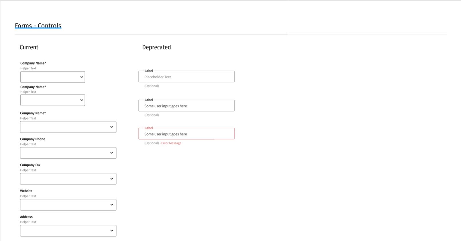
Accessibility best practices are very near and dear to my heart. It's a personal goal to make DemandStar more and more accessible over time. While I can't yet influence screenreader compatibility or even keyboard navigation, I'm modifying every pattern the styleguide to become more usable. For example, form controls: I changed their layouts to support screenreader expectations and increase readability.